Showing posts with label watercolor. Show all posts

Thursday, June 16, 2011

Brenan & Friends!


Caricature of my friend Brenan. Flattering, no?


It's a snail... It's a hotdog... No, wait. It's BOTH!


Sakura-con nerd II

Wednesday, February 23, 2011

Watercolour

I know I'm not British, but watercolour with a 'u' in it looks cooler.


Wednesday, January 5, 2011

Dutch Paintings


Trying to learn from the Dutch Masters. 


Most of these were studied from the Utrecht School (active late 1500s to mid 1600s), who were highly influenced by my favorite painter Caravaggio. 


This above is from a painting called "The Roman Charity," this was painted by Dirck van Baburen, Ruebens did 2 versions of this painting but it's not nearly as good as Baburen's interpretation. 


I'm fairly confident that the above is a study of Hendrik Terbrugghen another Dutch master who did lots of paintings of people playing instruments before "slappin' skins."


Frans Hals (also up with Caravaggio in my list of favorite painters).


More of the same but with a Dutch Palace.

Also I haven't posted in a while and may not very soon because I don't have my scanner with me. Just moved here to Seattle and I'm also pretty busy finding a job along with going to school, so have mercy.

Saturday, November 6, 2010

sketch DUMP: the Returun!

I'm back with a whole bunch of new drawings from my sketchbook. I remember I saw a post on Cartoon Cave where Pete drew from Charlie Rose interviews. It was such a good idea, it's perfect because the interviewee isn't moving around much and isn't changing appearances from shot to shot. Charlie Rose comes one a little later than most PBS programming that I watch, but the idea does work while food network too! Cartoons also work. 

"Tea for Two" is secretly about gettin' it on, at least that's how I hear it. below is one horrible attempt at drawing Jane Russell (it looks more like a man in drag) and the one that is painted is one that was more satisfying, this was while watching "Gentlemen Prefer Blondes."

Jane at work. Yum.

The rest. 


Monday, November 1, 2010

Adams Vs. Glass

Sorry that nothing has been posted in a while. I've been house sitting, so I had no scanner for a couple of weeks. As a result many of drawings have been built up which would have otherwise been posted. Let's fix that...

Lately, my musical tastes have been focusing on minimalist and post-minimalist. It's been growing since I've been listening to John Adams (below).


For a long time my appreciation for minimalist music has been ruined by one man: Philip Glass (below). For some reason Glass has been the poster-boy for minimalist music. It must be that his music best embodies what minimalism is. Where as Adams, typically referred to as a post-minimalist, is what a typical audience would like minimalism to be; I am that audience member. I like Adams work because it's far more inviting. He gives you a space and allows you to explore it. Glass on the other hand I find to be a bit harsher, it's also ugly sounding (his later work is better). 

Other composers that has been peaking my interest is Steven Reich and Arvo Part.


Also, I heard someone say that Fox News uses a blue background for someone they want you to like and red for the ones they want you to disagree with. Weird considering red = Republican and blue = Democrat. Anyway, the idea behind it was interesting so I used it; Papermate - fair & balanced. 


In the above image towards the left, notice how Glass' nostrils have been played with, the upside down ones are the most bizarre. 


more to come.

Wednesday, April 21, 2010

Gestures - and the first 8 pages of a book!

These are all doodles of people in the television-box, with the exception of the cat. I have Rita Hayworth, Orson Wells, Oprah, Groucho, Chico, Heidi Klum, 2 contestents from project Runway, a weird looke Tim Gunn, as well oddly rendered alec baldwins and the guy who plays Kenneth the page.
Harpo on the harp, and another gentleman from the movie I saw singing. I saw "Minding the Store" which was... alright, i think "A Night in Casablanca" was better, oh and the Rita Hayworth and Orson Welles was from "Lady From Shanghai" which was awesome, highly recommended.
people on the bus


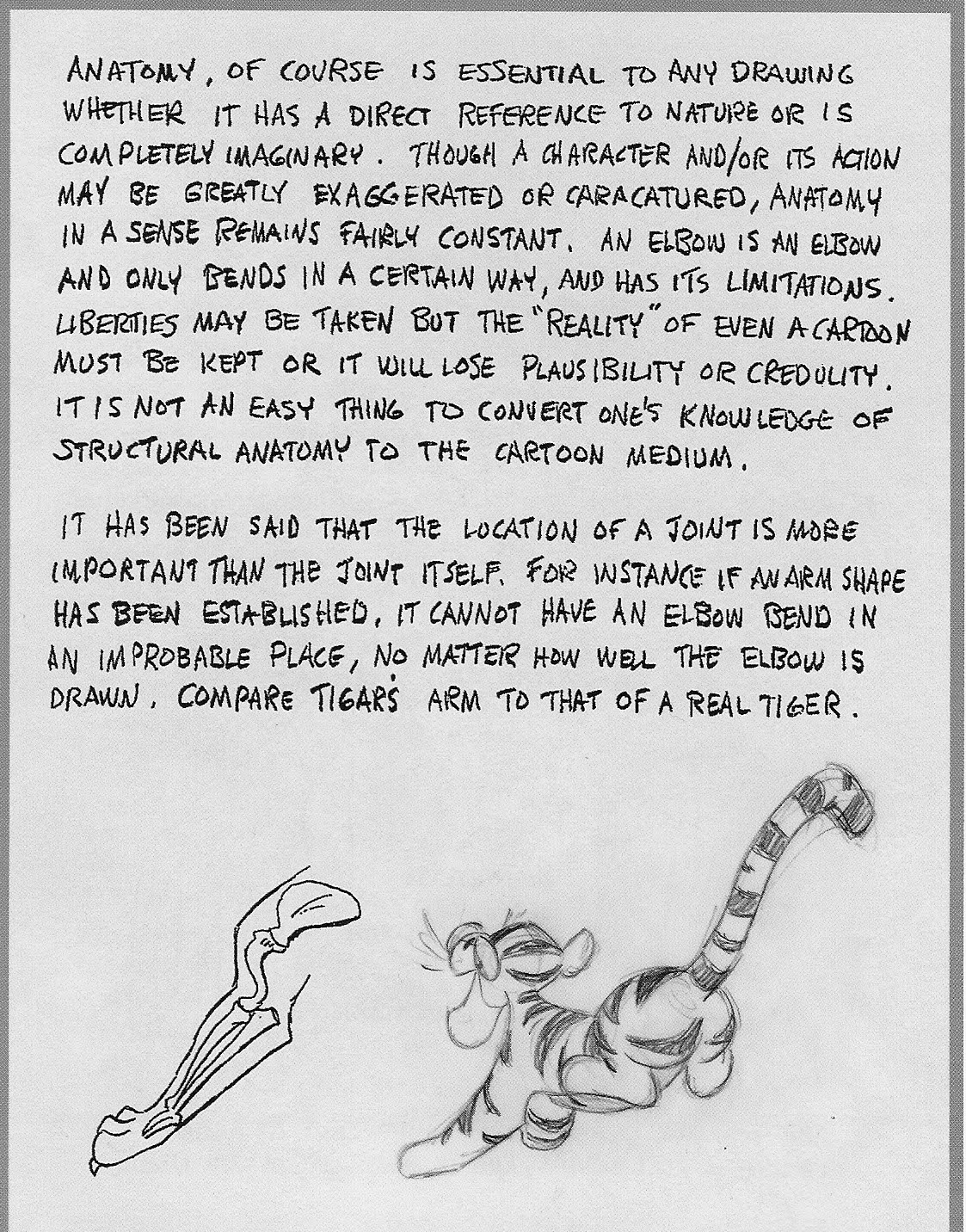
And here it is. The first 8 pages of Walt Stanchfield's "Drawn to Life" read, print, and enjoy!


Friday, April 16, 2010

doodles meet watercolor

i've been using watercolor a lot more often. Partially because I try my best to sketch everyday, when I don't feel like drawing i just color in ones that have been previously done.

Blind gesture drawings I think look fantastic colored in! I think i'm going to do more in future.

Watercolor kind of crinkles the paper of course, but it's alright i think it makes the sketches look more completed and makes em' more interesting to look at.

Also tomorrow i'll scan in the first couple pages of Stanchfield's "Drawn To Life" it's got lots of goodies in it.