Thursday, December 31, 2009

new doodles. new media.


I've been playing with color and media lately (I don't paint much), it's something i should learn to do considering i don't really have a portfolio.
One thing that i have been doing that is really fun and interesting to me is mixing media so i can get a nice contrast of texture (or create a new one!). I've been playing with perticuarlaly colored pencil and water color, occasionally i'll bust out my inks too like the picture above but not often.


This one above is just colored pencil (ugh... i badly screwed up on that nose). The thing that i didn't really care for about the pencils is that alone they create kind of an ugly texture if you want them opaque, that texture though is great for hair! Yet skin is a different story, also they can get a little muddy after a while and because it's so waxy if your on that top layer and you make a mistake that color has to be blended in but it won't go away, you're basically left with a smudge. I draw pretty loosely and this is a very, very bad thing for me. This happened a lot when you were in an area with very contrasty colors, look around the eyes and you'll see what i'm talking about.

I tried something different. Instead I only outlined in color pencil. I created a thin watercolor base of colors and gradients, next I used some pastel chalks to darken and smudge, and THEN i went in with color pencil. The nice thing is that I didn't have to apply it very thick as in previous drawings, which meant that nasty textures and unwanted smudges could be easily averted.

I'm still playing around with this, so I'll hopefully find new ways to color drawings.

Friday, December 25, 2009

Christmas Illustrations.

For Christmas i gave my Older Sister an illustration of her boyfriend, and her boyfriend a picture of her. I had them framed and then presented them.

This one i think is my favorite, it has a strong silhoutte and good framing with the use of the concertina, good colors too. 'Nuff said.

this one i ran out of time so i wasn't able to color in the rat and fully color in the books a nice opaque color. I tried to use the books to lead your eye to the top like a pyramid. The silhoutte in this one was trickier but i think i got it, also using the book and arm to frame the face worked out nicely.

Monday, November 23, 2009

Preston Blair


I got Preston Blair's book earlier this month, and have been devouring it. I have many drawings some better than others. During my studies however it wasn't till recently that i noticed that i stopped using the colored pencil bases... That was bad, the moment i picked them up again my drawings improved and looked closer to the desired produt. I'll be posting more of these from time to time. I also hope that i'll also be posting more often.

Thursday, November 5, 2009

Jack Horkheimer

I'm going to try using Flash more often so I get used to it. I made a couple caricatures of the infamous Star Gazer choose my favorite and digitally inked and painted him in.


God, he's old. I've been watching him since I was little, and I'm 20. My mom was watching him as a kid and she's 49! And he's still on PBS reminding us to "keep looking up."

He's a really tricky reference you'd think for being on T.V. since the 70's even if it was only for five minutes there would be better quality pictures of you when you did a google image search. Guess I was wrong.

Friday, October 30, 2009

Saturday, October 24, 2009

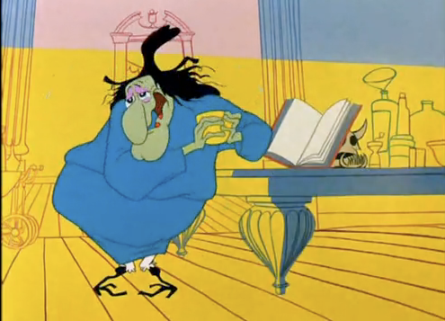
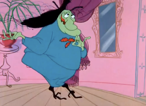
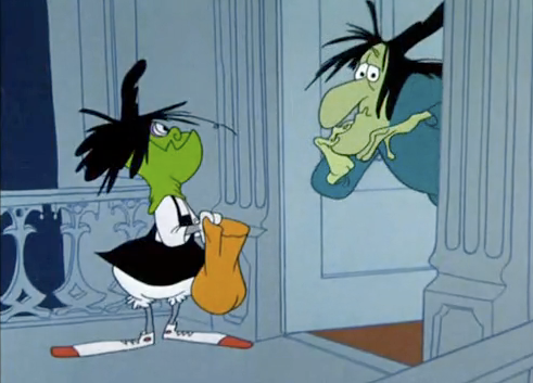
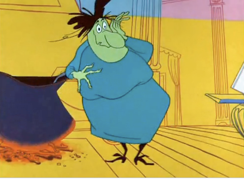
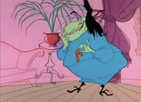
Witch Hazel

So it's one week till halloween, I hope all of you are excited. I watched some cartoons related in the celebration, and in doing so I found a Chuck Jones character that I had forgotten about! Witch Hazel who was brilliantly voiced by June Foray (you may know her as Rocky from "Rock and Bullwinkle"), she is so hilarious so ridiculous in fact that i decided to draw her, and let me say she is no easy task. And even when I did have an idea of her construction and start drawing her in my own poses i was still off.


It was a frustrating reminder that i need to stick with drawing cartoons from the 40's and not the 60's when construction became a lot more complicated. But not all was lost in fact, the hands post from yesterday were drawings of her hands in different poses, so i did get something out of it.

Here are some of the expressions/poses that i referenced above, along with some that i should have drawn.
Here's the LINK to the actual video for some reason the embedding has been disabled.

Friday, October 23, 2009

Hands - but only with four fingers.


Why do they only have four fingers? Well because I also did a character study who had human hands but only four fingers, but more on that tomorrow. Also I plan on using more color pencils in my sketches in this way.

Wednesday, October 21, 2009

Billions and Billions

if you ask me Carl Sagan is one of the most brilliant people of the later 20th century. no one has really instilled a deep passion for learning and knowledge more than he did. And I'm really hoping that I get the complete "Cosmos" DVD for Christmas this year (crossing my fingers!). Anyway I worked yesterday on a caricature of him, unlike Nina who has easy-to-exaggerate features... Sagan, not so much. It took me a while but i got pretty close with the last two (below), i might continue to work on him.

I'm going to try and make them more like the Sagan on the right where his head is more square and fat.


Below are my first attempts at drawing Mr. Sagan. the one on the upper right was by far the best out of these first attempts. I have a weird Spock looking one, one Alfalfa-esque, and the other one has a more Richard Dawkins kind of thing going on. the first thing my eyes went to was his eyes, brows, and nose so i first focuse my attention there. I was also working on his smirk that he always seems to have.

Second page i'm getting closer working on his cheeks. That "Gah!" you see is me expressing frustration on the page, i do that sometimes.


This is the second to last page i worked on, i decided to just take a picture and draw it not as cartoony but still exaggerating on features so i know where to apply emphasis. As it turned out my eyebrows were a little off and he needed a buldge on the chin which I was also putting to far down.
It still needs some work but until then enjoy Mr. Sagan explaining numbers that are more than billions and billions!

Tuesday, October 20, 2009

Nina

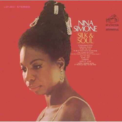
I talked about Nina Simone a couple posts back so i wanted to share this drawing i've done. These pictures are first attempts and still need some work but pretty good for what it's worth.


She had this really interesting hairdo back in the 60's where it looked like a fuzzy wedding cake with jewels coming out of it. I would have given her bigger/buffer arms (spending time on that piano all day gave her some sweet guns).

Dr. Nina Simone was amazing, she attended and graduated from the Julliard school of music. She wanted to be a classical pianist more than anything. To make ends meet while attending school she preformed at nightclubs, one owner said she couldn't preform unless she sang and that was the spark that started it all. She abandoned her classical dreams to pursue what she thought was more important, the civil rights movement, and she wrote and preformed these famous protest songs: "Mississippi Goddamn," "Four Women," "Ain't Got No," and her most famous "Young, Gifted, & Black." My favorite song that she's ever preformed is "Sinnerman", almost 10 minutes of pure awesomeness. She was not only famous for her protest songs but her amazing and often chilling interpretations of other songs. She could not be defined as a soul, folk, pop, or gospel singer, because she sang it all.

"I want to shake people up so bad that when they leave a night club where I have performed, I want them to be to pieces." -Nina Simone

Monday, October 19, 2009

Your's Truely (& a couple of H&'s)

Got bored and drew myself, clearly I'm not in a very good mood. Usually when i draw myself I'm in a bad mood b/c i don't have any ideas at that moment so I just keep drawing by drawing the most obvious subject. I like that high wire act, I love high-wire gags (and acts for that matter) for some reason I've always been fascinated by that as a kid and i'd like to work on something centered around it I would have to much fun thinking up of things to do.


Ugh... even my writing sucks today. sorry.

Saturday, October 17, 2009

On the note of my last post regarding African American caricatures I do have another one to share, but this time it's women.

Her afro would be fun to draw in fast movements, her hair allows you to play stretch and squash with it. There's also the woman in the bottom right, she's some kind of 60's civil rights soul singer... I was listening to Nina Simone and she got me goin'. However the woman with the afro was inspired by a song called "Feeling Free" by Nicole Willis and the Soul Investigators, I think when i'm done with my current project maybe i'll do something with that song, I would really like to do something with Nina considering that she's a damn genius but her voice isn't terribly exciting for animation, i was considering maybe doing "Feeling Good" the lyrics give me something to work with and she does some pretty fun scat singing in the end but other than that her voice is typically pretty static. Anyway, too early to tell for now.

Also, ignore the drawing on the upper right, it's shit, that's why it's unfinished.

Friday, October 16, 2009

Little Project.

So while I've been improving my drawings i decided possibly tackling on a little project. It's just going to be kind of a music video to a short song that i really like. I'm still pretty early in the project to have a desire to tell you what it's all about and what will happen. But I'll share with you my main character.

The song was made back in the fifties and sung by a very sly and hip black man (he was associated with the beatniks). So I made black character in a zoot suit, i think that his overall appearance is instantly recognizable and without speaking a word we have a general idea of what kind of person he is, energetic, fun, and hip. He is based off of Prince Chawmin' from "Coal Black & da' Seben Dwarves" but the racial stereotypes will be a little toned down as to not alienate my entire audience.


Speaking of racial stereotypes, let me know about what you think about how i drew his lips I'm concerned that maybe it's a little too much, but I don't want to change it for a couple reasons. First being that they are incredibly fun to draw, not just the lips but this entire character just falls off my pencil so effortlessly. One of the reasons why it's fun to draw is that they are very expressive and i can get some good emotions out of them, I also can't wait to start animating him speaking, I'm going to have tons o' fun exaggerating the way he talks.


But another reason is that, I'm afraid that by toning it down a little he won't be as graphically recognizable, The new Disney movie that's coming out "The Princess and the Frog" which is centered around people of a darker complexion, some of the drawings just strike me as stock doodles of white people they had laying around and painted a different color. I think that if you take away the color and all you have left is the ink, most of the characters you probably wouldn't think were black unless someone told you.

I'm of course not telling anyone to draw features so exaggerated that they are offensive, but to draw something until it's universally recognizable and some of the new Disney characters they do a pretty good job at realizing this fine line, but they're human drawings also look like they are not very fun to work with.

Also, so long as your not being tasteless and just having fun, no one should be offended.

Tuesday, October 13, 2009

Hello Again.

Sorry that i haven't done anything in a really really long time. But... uh... well... I don't have an excuse, I'm sure that I did but I have already forgotten what it was.

Don't worry though, because in the time of my absence I haven't stopped drawing. So i will be uploading tons and tons of doodles for you to look at, including Billford's and friends and family, and a new project I've been working on. Hopefully I will be uploading on an everyday basis like I used to.

I will start either tonight or tomorrow I just wanted to make the announcement.

Monday, August 31, 2009

Not Much

I don't have much to offer today, here are some Billford sketches I did couple days ago. I'm just testing strech and squash and trying to perfect his "look." As you can see i need to work on his body, not very good.Maybe later this evening or tomorrow i'll make some posting of the Aracuan who i mentioned in yesterday's post, i was going to do it today but now i can't.

Sunday, August 30, 2009

Jose Carioca

When I was a kid we owned the Three Caballero's, it was a Disney film made in 1943 as part of the 'good neighbor' act to help us gain allys during WWII. Out of it came my two favorite Disney characters created. Jose "Ze" Carioca and the Aracuan.

Right now i have depicted Jose, i like Jose because unlike many of the Disney characters that i'm aware of he was a quintessential cool guy. Panama hat, bumbershoot, and what appears to be a zoot suit, he loved hanging out at cafes, dancing, meeting beautiful women, and smoking fat cigars. He is Donald Ducks cousin (I believe, I know that they were related, the duo were commonly referred to as 'Birds of a Feather') so cartoons of him are usually with Donald explaining the beauty of his beloved country (HAVE YOU BEEN TO BAHIA?!), Jose is very energetic but suave when he's around the ladies, incredibly friendly, and is very nostalgic.

I did a quick drawing of him using constructions, I then compared it to the original and made notes regarding proportion, and made another one while refering these notes, it was very close so i made a little construction model in the bottom right so I wouldn't forget. I then started to focus on his head.
His head was pretty tricky for me because of that beak. but i think the hardest part was getting that lower part of the beak the right size and shape, what i did to help me was break some of the construction even further making only squares and rectangles to get the right angles and size, i then scultped these shapes into round objects which became the forms and molded his face.
What i didn't catch was the shape of his eye, which was too narrow and needed to be rounder and more egg shaped, which I oversaw.

Jose has only been in a couple things in the early 40's "Saludos Amigos" "Three Cabarello's" "Cafe de Samba" and "Aquarela do Brazil" he also appeared in a couple comics along side Donald. Jose is much, much more popular in Brazil and has his own comic and appears along side Mickey and he even has a superhero persona. I'd like to get a hand on some of these comics, I'll try and find some, in the mean time here's a video of him.

Saturday, August 29, 2009

Donald & Some of Goofy

Another drawing, this is Donald being his typical self pouring water in Goofy's Tuba as a practical joke, haha what a bastard. This below is the finished drawing.
here are he prelimanaries, it took me a while to get the right shape, i was making his ass an elipse when it should of been a circle. I watched out for making his hand with the jug high enough I was making it level with his face when it should of been a little higher. Proportions can be seen figured out towards the right of the page, Donald is about 3.5 maybe even 4 heads high, his feet are his heads height, and he is about 2 or 2.5 heads wide (w/o the extended arm). Once i got everything done I made a clean construction model in the bottom left, and i circled it. Also on another note, a friend who's mind is always is in the gutter told me that the Donald in the upper left looks like he stroking a penis, what do you think?
Goofy on the other hand was kind of tricky. Because on the original image I didn't have much to go off. I focused mostly on the construction of the head which was very simple, i worked a little on the body, but as you can tell in the finished drawing most of the work didn't make it. The image is mostly about Donald really. the hardest part about Goofy was making sure his neck was the right length. it was usually too far away.

Friday, August 28, 2009

New.

John made a new post, so i decided to take a crack at drawing this image, It took me a while but with making preliminaries to better understand the image I got it just fine. This one was more of a challenge, so with the help of forms and line of action, i studied proportions pretty vigorously to make sure that the characters look right.
Below is the finished product.
Here are some drawings of the turtle, forms was pretty helpful but in the end, proportion seemed to dominate so i could make sure he wasn't too big or too small compared to the rabbit, it drove me crazy! I also tried some different expressions on the turtle, not sure why I did that.
Rabbit was a little trickier, in fact when i started i gave up and did some different expressions which i thought was funny. Instead of taking pleasure in how he hit the turtle I changed it to guilt and despair, "I didn't mean to hurt ya' i was just horsin' around! whaaaa!"After procrastinating with the face i decided to get down to business! what made it helpful was again, proportion, that rabbit is four heads wide, with that my line of action was more accurate, the butt goes one head high, body goes down one head, etc. The drawing on the bottom-right is him after he got shot in the face... don't ask.
Proportion, Construction, Line of Action, all helpful in achieving this drawing. I like to think that i'm also doing hierarchy but i'm still not totally sure what that is.

Wednesday, August 26, 2009

ZiZi

I decided to try out another character this time female.
Using a line of action was perticuarly helpful with the pose on the left. I liked the idea and overal way the character dressed (baggy clothes and fast movements, how FUN!), but the face needed some work.
I got very close on the second try (right), and on the third I was very content with what I had drawn. Again the sketch on the left was helped with line of action, too bad it's not very good (perspective is waaaaaaaay off). On the bottom left are a bunch of possible names, I wanted her to be Eastern European, I selected Hungarain names and culture because my oldest sister's boyfriend is Hungarian and he's pretty spiffy. I decided to select the name Zigana which roughly translates to 'Gypsy,' but i think everyone will call her ZiZi for short. I might name the cat above Paliki, but i need to work on the cat's look.
Once I get a selected look that i can agree with the sketches look so much better. anyway i did a full body drawing, she's on her tip-toes for some reason. And everything else show stretch & squash and different angles. Everything to me seems fine, all i want to work with is the front, but only the hair. Oh also the scarf on the position looking up isn't in the correct perspective, i really need to watch out for that.
I traced them in Flash and added color to see what she might look like all cleaned up. not too shabby (for me at least).

I showed a friend the completed designs you see above and she said that it reminded her of the Gorillaz. I was flattered because i do very much like the band, but at the same i was insulted because even though they can be drawn from most angles going left and right, it's a little harder drawing them up and down.


Oh dear.


Do a google search of the word Gorillaz and you will be hard pressed to find pictures of them looking upward or down. I luckily, now know how to make characters without that flaw. But to be fair to Jamie Hewlett, i did go through a huge Gorillaz doodle phase where everything i drew was in that style.

Getting Closer to the Finish

As I progress and read more of John's blog, i get closer and closer to the finalization of Billford's design. This was using Preston Blair's baby head, like i mentioned a couple days ago in a previous blog entry. This design is much easier to move around, i'll make some extra poses from different angles instead of the 3/4's i constantly put up!


I also decided to trace and color them in using Flash just to see it cleaned up.


all i really need to do is work a little more on the eye shape and i should be good.