It's been a while.
Paper Mate
Hello, this is a blog for all my sketches, doodles, and anything else put on paper by me. Please feel free to comment/critique, there's no such thing as a mean comment so long as it's constructive and helps me improve.
Wednesday, July 11, 2012
Thursday, March 8, 2012
Pon Pon Pon
Here's a drawing of J-pop singer Kyary Pamyu Pamyu from the music video for her song "Ponponpon." I should hate it, but I don't. In case you think this is a reflection of Japanese culture, be relieved that it isn't. When my friend from Japan saw this she said that she was embarrassed for the entire nation of Japan.
This was done with mostly gouache with some color pencil and sharpie.
Preliminary drawings below.
I really wanted the finished drawing to look more like these caricature above, but i didn't work out that way unfortunately. It's hard to paint faces like these on a smaller scale.
Labels:
caricature,
gouache,
illustration,
j-pop,
Kyary,
painting,
Pamyu,
pon
Tuesday, January 24, 2012
THE AMERICAN ART BOOK
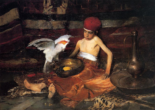
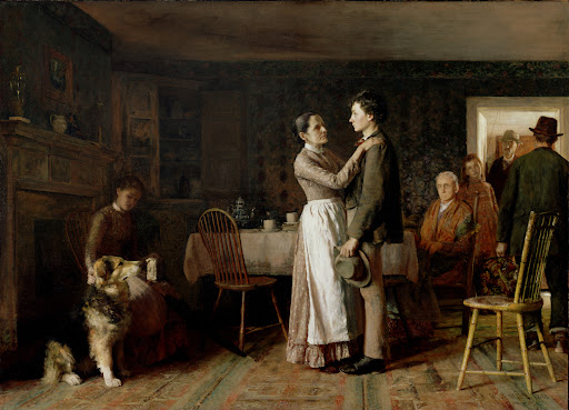
Yesterday, I took me a trip down to Goodwill with my friend. I decided to venture towards books to see if there was anything of interest, out of the corner of my eye there was a huge thick 500 page tome called "The American Art Book" by Phaidon Publishing. Inside in alphabetical order were 100's of America's most important and influential artist, and for a trifling sum of $2.99 it was mine, ohhhh what a bargain!
I flipped through it and there were some incredible artist and works that I had never heard of. Here are a couple that grabbed my attention.
WILLIAM BELLOWS
I flipped through it and there were some incredible artist and works that I had never heard of. Here are a couple that grabbed my attention.
JOHN WHITE ALEXANDER
It's no surprise he is highly influenced by John Singer Sargent, actually they were good friends.
He seemed pretty interested in women turned away from you.
Samuel Clemens!
There were so many to pick from but this should give you a very good idea of his work.
THOMAS ANSHUTZ
WILLIAM BAILEY
CECILIA BEAUX
JAMES BROOKS
Frank Duveneck
Exquisite Alla Prima!
Al Hansen
Thomas Hovenden
WILLIAM BELLOWS
Actually I've seen the one above but forgot about it, I had never known who did it until now. You can feel the movement in that one, it's fantastic!
Tuesday, January 3, 2012
Poster
For a friends show in Iceland.
Sketches behind the poster!
The earings are inspired by this video (see if you can find them).
The silhoutte in the sketch below is much stronger. I regret not adopting it.
Tuesday, October 25, 2011
Work, School, bleh
Haven't had a lot of doodling time lately. Hope that will change in a couple of weeks.
I've been working a lot, almost 40 hour weeks. I work at a children's museum and I see this (below) a lot.
I've also been slowly doing digital painting in place of traditional. So you'll be seeing more and more digital work in the future.
Saturday, September 17, 2011
Cinemascope
This image below is in the cinemascope 2.39:1 format (compared to the image above in a traditional 1.85:1 "flat" format). There were few animated films made in cinemascope because the image is stretched out to fit on the frame of the film, it passes through a special lens that un-stretches it creating a wide, very cinematic image. Since it was a photographic process making animated films with anamorphic lenses proved to be a very difficult and expensive process. Disney made "Toot, Whistle, Pluck, and Boom," "Sleeping Beauty," and "Lady & the Tramp" in the cinemascope format, there are most likely others but those are the most well known of them.
Cinemascope also presented a couple other challenges compositionally. Having one person on the screen left a lot of space around them, close-ups were awkward, shots had to be longer b/c too many cuts looked too busy and were distracting, and if the lens used was too wide it caused an unwanted vignette. However, those things were easy for directors and DP's to overcome and 'scope (often referred to as anamorphic) is still a popular choice to shoot movies in. Oddly 2D animation isn't, even though now it's mostly a digital process. The only animated film that come to mind made recently in a wide format is "Mind Game" a Japanese film. But Disney's last venture "Princess and the Frog" was made in standard 1.85:1, and Chomet's "The Illusionist" was also in 1.85:1 even though both films were painted, inked, and colored digitally.
( Above and below stills from "Mind Game" 2004)
I have seen a lot of short films and experiments in wider formats but it's weird to me that feature length animated productions (CG is the exception) doesn't adopt it more often. All you really have to do is change the settings and presto! Wider screen, more cinematic venture.
Labels:
anamorphic,
animation,
cinemascope,
mind game,
widescreen
Subscribe to:
Posts (Atom)


+Young+Girl+in+Green+Dress.jpg)


+by+Cecilia+Beaux,.jpg)


